Parking Panorama, a family-run car park by Katowice Airport (Pyrzowice)
Scope
visual identity, printed materials, website
Year
2026
Link
parkingpanorama.com
Before
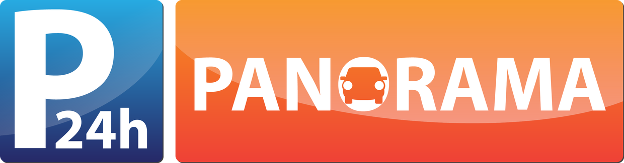
3.8:1 proportions, two gradients, the same navy as everyone elseAfter
square, one colour, legible from the gate and as a Google avatar
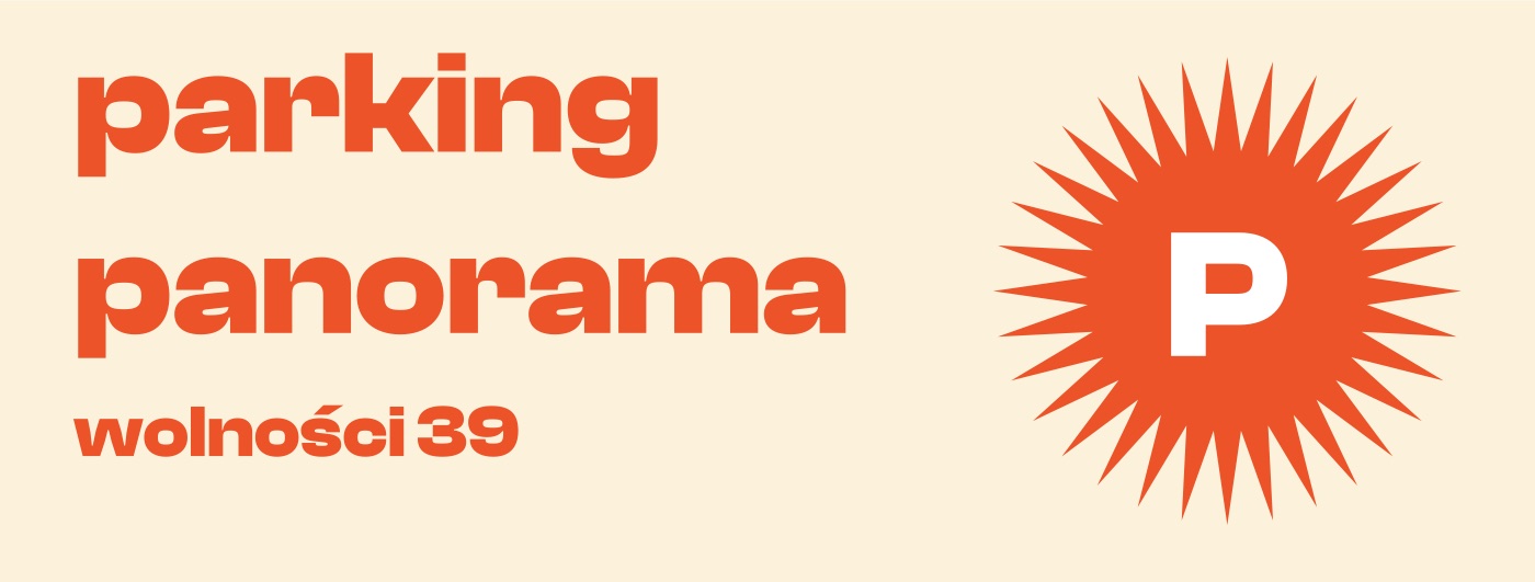
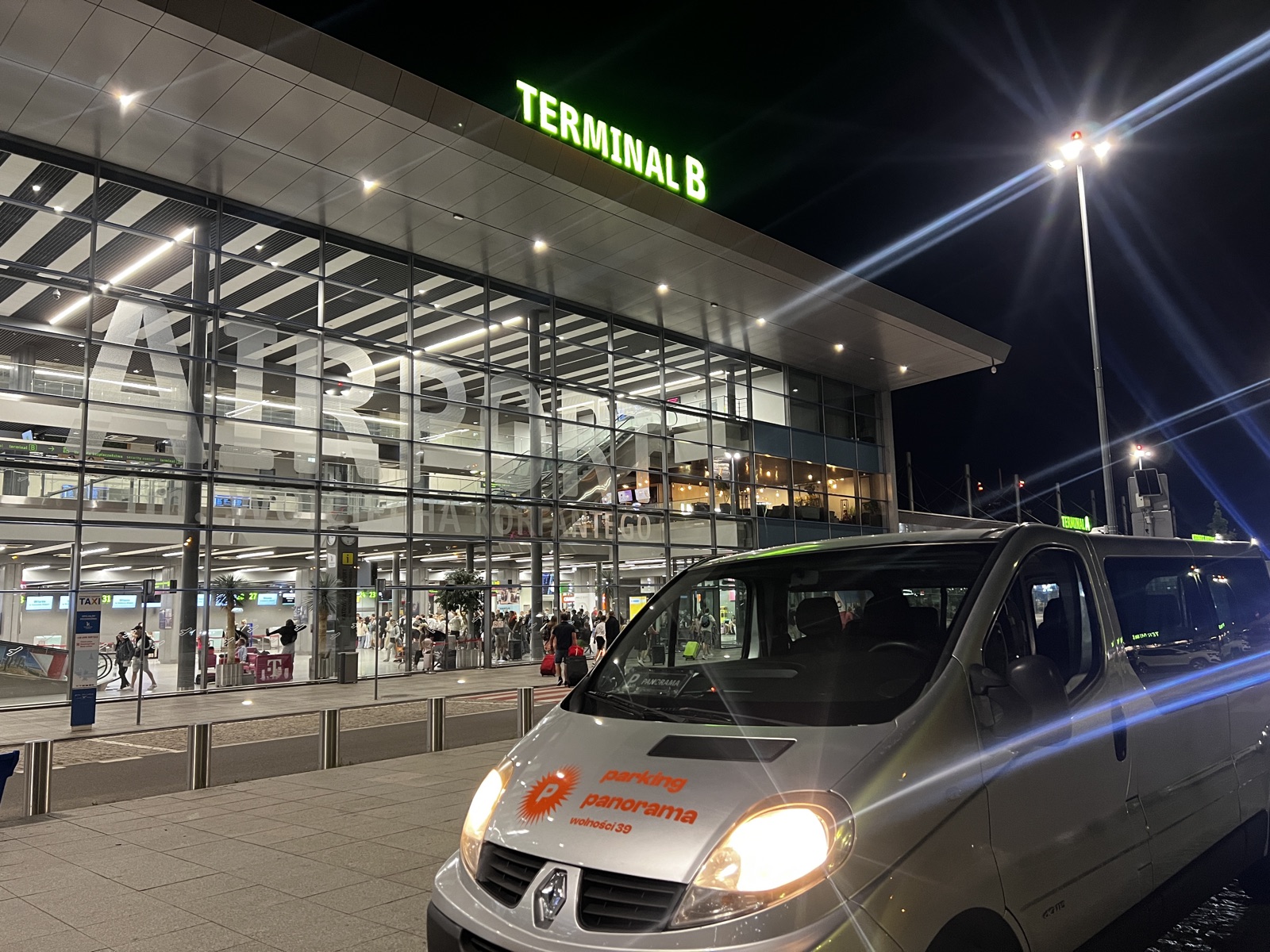
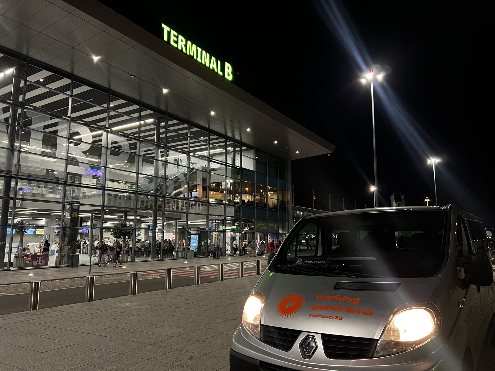
The old logotype was almost 4:1 — it worked in the website header and stopped working on the gate, on a sticker and as a Google avatar. The new mark is a rosette: orange, round, legible from the road. The whole category is navy, grey and photos of cars, so the rosette stands out on its shape alone.
Colour
Sun#D93F05
Cream#FFF0D9
Paper#FFF9EF
Night#161412
Type
Aa
Clash Displaymark and headings
ABCDEFGHIJKLM abcdefghijklm 0123456789
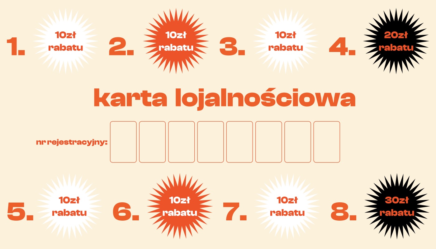
The banner on the gate. The same mark works at every size, from four metres down to an avatar.A loyalty card — the eighth stay is free. Something the customer keeps in their wallet and sees on every trip.Stickers for the posts and barriers. The website and the car park match, so the customer knows they have come to the right place.The price list moved onto the first screen, because it is the only thing a traveller asks about. Before, you had to hunt for it.Booking and directions without scrolling — the decision takes a dozen seconds or so, usually on a phone on the way to the airport.
Result
12–14% click-through rate in search against a market average of 3–5%, 656 visits a quarter, more than half of the traffic organic — without spending a złoty on ads.