an academic project at AGH in Kraków, no brief and no client
Brand
NAWARA.CO, chosen as inspiration, not as a commissioner
Scope
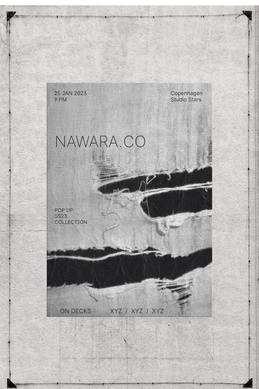
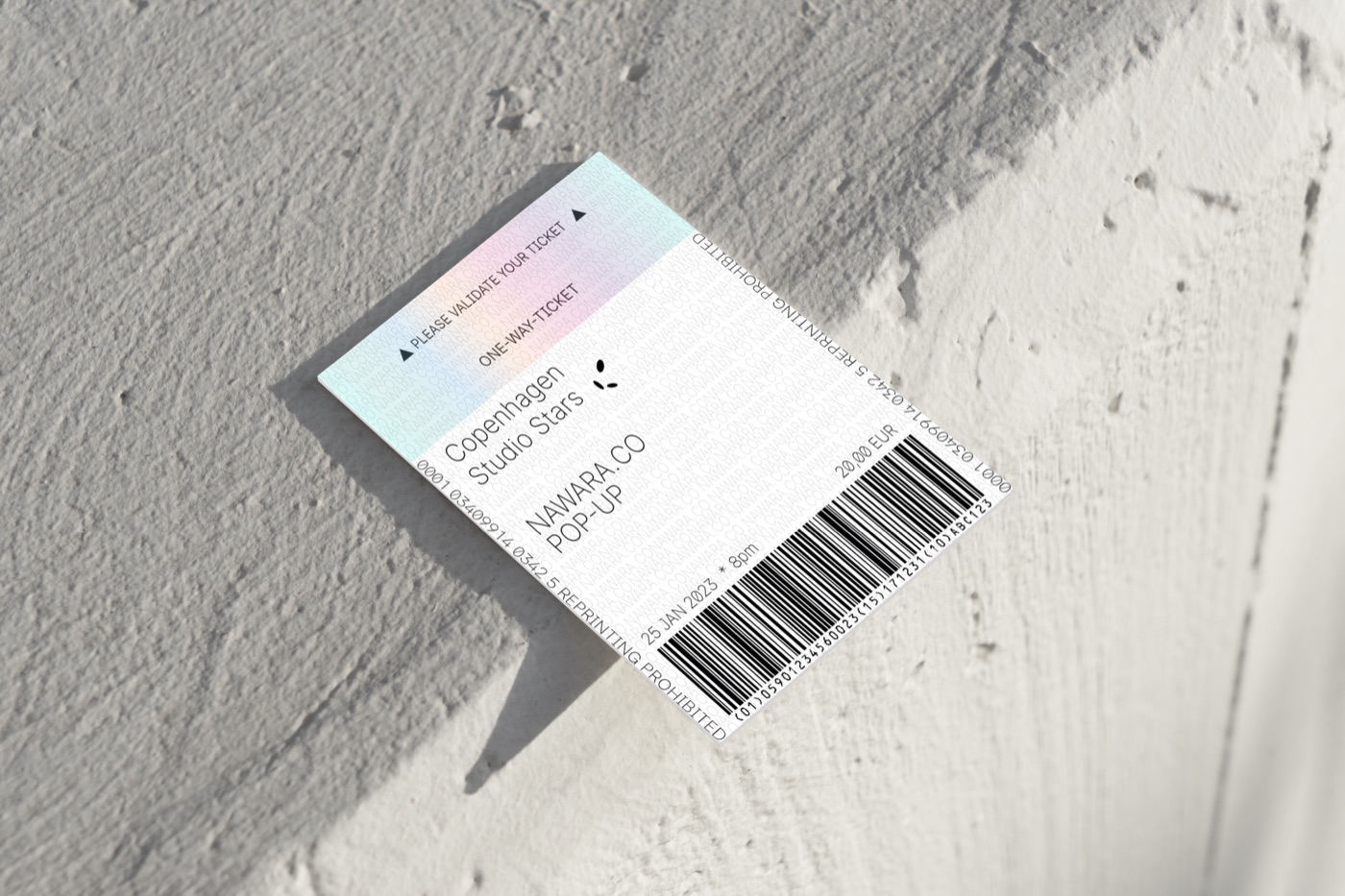
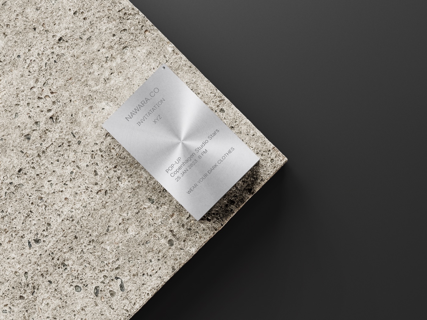
poster, tickets, invitations
Year
2021
Texture instead of a product photo. The poster talks about the material, which is what the brand actually sells, and it does not date along with the collection. From a distance it reads as an abstraction — on a wall in the city you see a patch and a rhythm, and only up close the detail.Monochrome, no colour at all. That makes you read the composition and the texture instead of looking for a pretty shade.Typography pushed into the background: a light, narrow sans serif. On promotional material for fashion the text should not compete with the image.
Result
I sent the finished materials to the owner of the brand — she replied that I had got the aesthetic exactly right.